


CASE STUDIES


Helping Users Onboard with Confidence
ZenLedger is a digital asset tax platform that helps users simplify crypto tax compliance. It is vital to guide new users through wallet and exchange imports, ultimately converting them into long-term subscribers.
My Contribution
As the sole Product Designer at ZenLedger I worked on countless iterations of their SaaS app over five years, I also helped them launch a portfolio tracker app and, redesign a crypto compliance and investigation platform. This case study showcases one important redesign where I lead the UX/UI and testing, it showcases how my redesign improved user engagement and conversion rates.
Client
ZenLedger - Crypto Tax SaaS Platform
Category
Fintech, Blockchain/Crypto Web3
Team
2 Developers, 1 Product Owner, Customer Services
Timeline
2 Months
Problem
The initial post-sign-up funnel drives users to connect wallets and exchanges, kickstarting engagement and data onboarding. However, users were abandoning the import process leading to low conversion rates and customer service drain.
Solution
Revisit the onboarding and import flow to improve user trust and confidence aiming to increase first‑time setup completion and perceived value.
RESEARCH
Key Findings
User’s got lost in the process
I conducted interviews with the customer service team, the closest people to customers, and gained valuable insights into issues users were facing.
- I can’t find my wallet or exchange
- Unclear process
- Where am I?
- Mobile experience broken
Understanding the analytics
I analysed Google analytics and DataDog to study heat maps, review funnels, drop-offs, and rage clicks, identifying where users were failing to progress.
- Drop-off before users completed first import
- Mobile experience broken
- Dashboard adding confusion
- Funnels displayed odd behaviour
Constraints
Ghost in the machine
Legacy code meant any changes to the platform were slow and many pieces of functionality had to be rewritten, that meant long waiting times to get new ideas shipped, and testing and iteration was extremely slow.
Time restraints
Any new design changes had to be done before the next tax season. Developers were always busy fixing bugs and dealing with the latest blockchain additions. This meant we had little bandwidth to get the changes made. Each change had to be made when a developer was available which meant having to incrementally release functionality.
DESIGN
Designing for Clarity
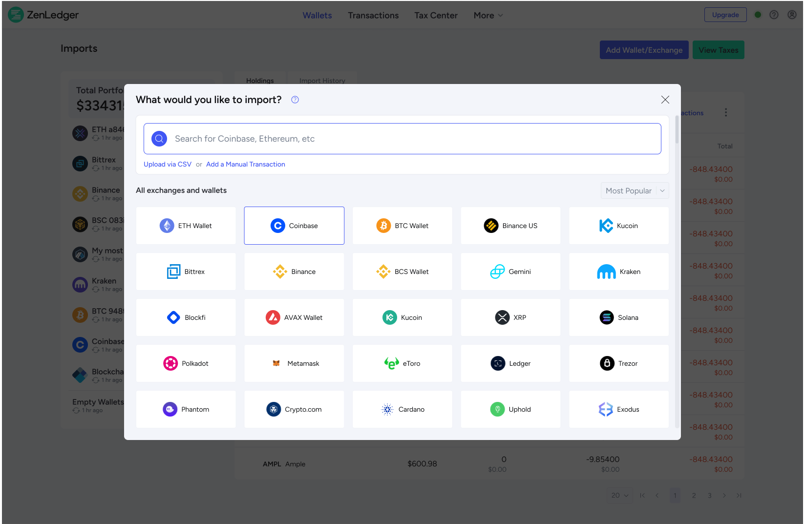
Before: Browsing or searching for wallets and exchanges to import gave the user too many decisions, forcing them to choose either, wallet, blockchain or exchange.
After: New search that allowed users to enter any phrase to search across all categories, utilising an auto suggest to quickly display results.
Before: Page based layouts meant users were switching between multiple screens losing context.
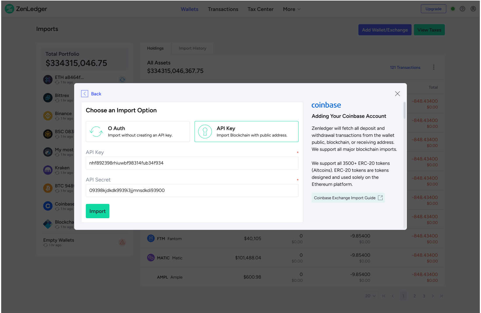
After: Replaced the page-based flow with a modal-based experience, so users could complete imports without being thrown into new contexts.
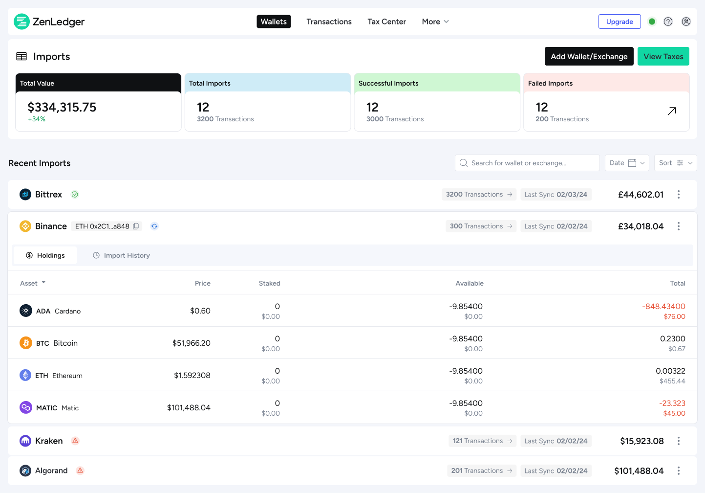
Before: Dashboard showed high amount of visits, however, bounce rates were high, heatmaps showed users mainly used it to view holdings.
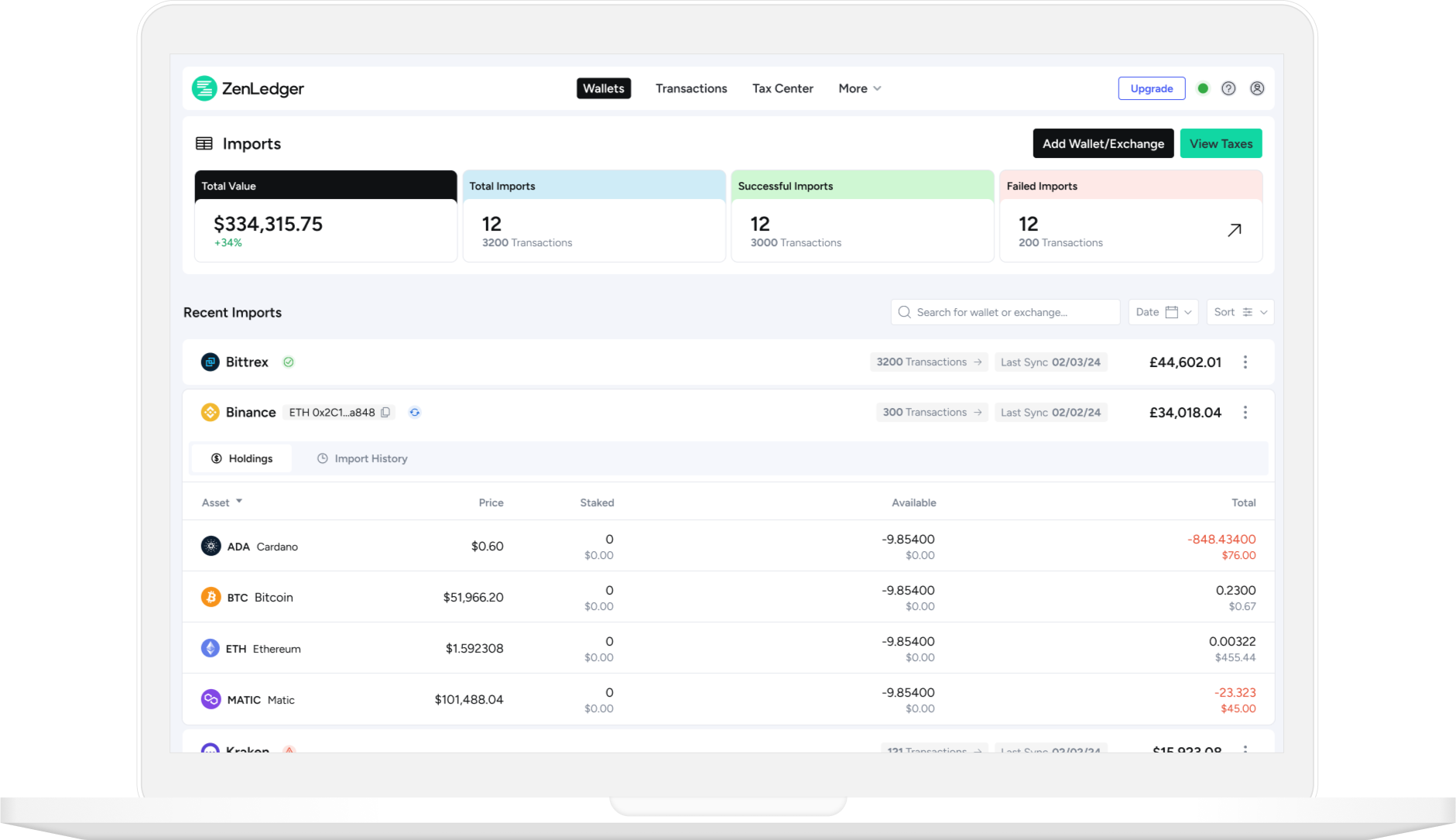
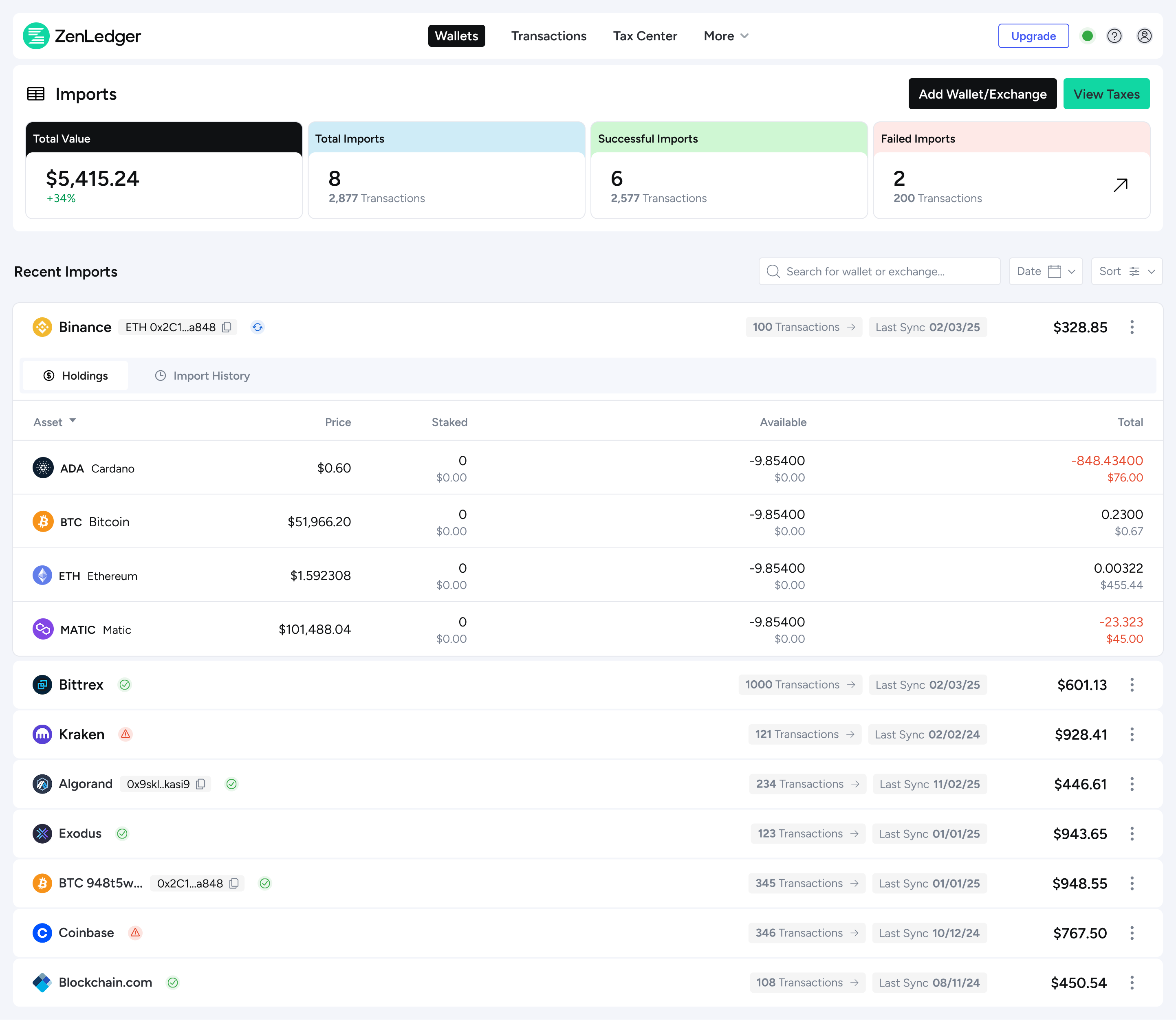
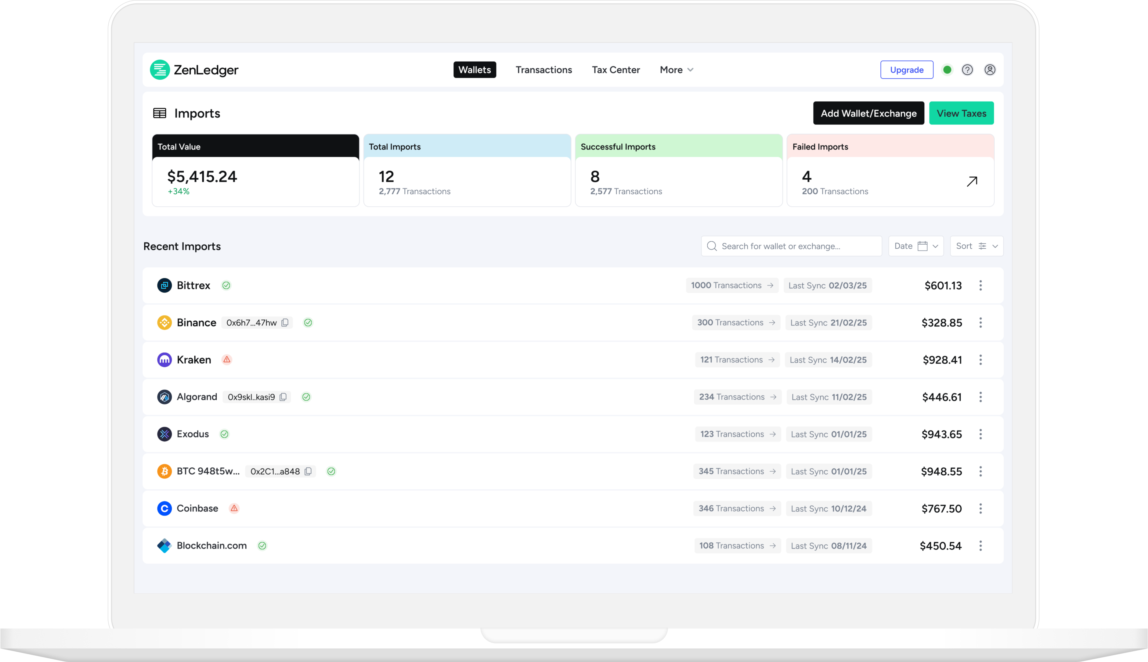
After: Consolidated Holdings and Imports into one unified view, allowing users to see progress and assets in a single place.
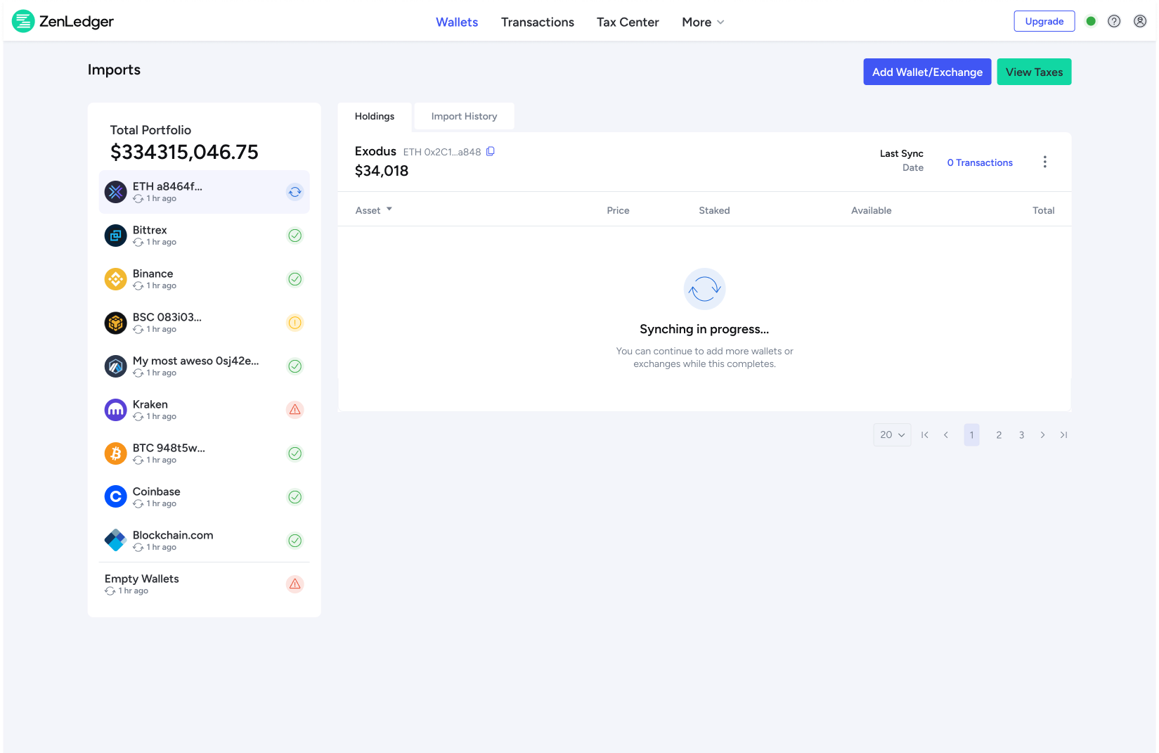
Before: After importing accounts, users had to continuously refresh the screen to see if their import had completed.
After: Added auto-refresh and real-time toast notifications to clearly show when imports were successful or if there were errors.
Feedback from customer service
CS feedback: This would make it easier to support customers and solve many recurring user issues. Tested with the team, and feedback was very positive.
Validating through user testing
Real-time testing with new users on UserBrain.com showed clear improvements: uploading and sorting wallets was significantly easier.
Designing for Clarity
OUTCOME
Measurable Impact
~2x Faster wallet imports
Streamlined the process, reducing average completion time from ~5 minutes to under 2 minutes.
How we know
Time-on-task data from analytics.
Why it matters
Quicker setup reduces drop-off and gets users to tax results sooner.

18% Higher task completion rates
First-time import completion increased by 18% after launch.
How we know
Funnel tracking in Google Analytics.
Why it matters
More users reach the point where they can see value from the product, boosting retention.
25% Fewer support tickets
“Can’t find my wallet” tickets fell by 25% within a month.
How we know
Tagged support tickets in Zendesk.
Why it matters
Reduces strain on support and improves user trust in the platform.
Reflections
Working on ZenLedger was a great opportunity to enhance a product at a time of significant growth. Some key takeaways include:
User-Centered Design: Direct user feedback informed every design decision, making the experience more intuitive and reducing friction.
Trust & Transparency: Trust is a critical factor in handling sensitive financial data, and improving the onboarding process helped increase user confidence.
Iterative Improvements: By making small, iterative changes and continuously testing with users, we were able to refine the flow and reduce customer support calls significantly
Next steps
Ability to import multiple blockchains at once: A valuable next step would be letting users import data from multiple blockchains in one flow, no matter the wallet or exchange. This would cut down on repetition, save time, and lower the risk of missed transactions—better matching how users actually manage their crypto.
Adding a progress stepper: Introducing a progress stepper would guide users from their first import through to downloading tax documents. It would make the process clearer, reduce uncertainty, and give users confidence that they’ve completed all steps correctly.
Next Case Study

Got a project in mind?
Let’s work together
Say Hello
CASE STUDIES
Helping Users Onboard with Confidence
ZenLedger is a digital asset tax platform that helps users simplify crypto tax compliance. It is vital to guide new users through wallet and exchange imports, ultimately converting them into long-term subscribers.
My Contribution
As the sole Product Designer at ZenLedger I worked on countless iterations of their SaaS app over five years, I also helped them launch a portfolio tracker app and, redesign a crypto compliance and investigation platform. This case study showcases one important redesign where I lead the UX/UI and testing, it showcases how my redesign improved user engagement and conversion rates.
Client
ZenLedger - Crypto Tax SaaS Platform
Category
Fintech, Blockchain/Crypto Web3
Team
2 Developers, 1 Product Owner, Customer Services
Timeline
2 Months
Problem
The initial post-sign-up funnel drives users to connect wallets and exchanges, kickstarting engagement and data onboarding. However, users were abandoning the import process leading to low conversion rates and customer service drain.
Solution
Revisit the onboarding and import flow to improve user trust and confidence aiming to increase first‑time setup completion and perceived value.
RESEARCH
Key Findings
User’s got lost in the process
I conducted interviews with the customer service team, the closest people to customers, and gained valuable insights into issues users were facing.
- I can’t find my wallet or exchange
- Unclear process
- Where am I?
- Mobile experience broken
Understanding the analytics
I analysed Google analytics and DataDog to study heat maps, review funnels, drop-offs, and rage clicks, identifying where users were failing to progress.
- Drop-off before users completed first import
- No feedback (success, error)
- Dashboard adding confusion
- Funnels displayed odd behaviour
Pain Points
Ghost in the machine
Legacy code meant any changes to the platform were slow and many pieces of functionality had to be rewritten, that meant long waiting times to get new ideas shipped, and testing and iteration was extremely slow.
Time restraints
Any new design changes had to be done before the next tax season. Developers were always busy fixing bugs and dealing with the latest blockchain additions. This meant we had little bandwidth to get the changes made. Each change had to be made when a developer was available which meant having to incrementally release functionality.
DESIGN
Designing for Clarity
Before: Browsing or searching for wallets and exchanges to import gave the user too many decisions, forcing them to choose either, wallet, blockchain or exchange.
After: New search that allowed users to enter any phrase to search across all categories, utilising an auto suggest to quickly display results.
Before: Page based layouts meant users were switching between multiple screens losing context.
After: Replaced the page-based flow with a modal-based experience, so users could complete imports without being thrown into new contexts.
Before: Dashboard showed high amount of visits, however, bounce rates were high, heatmaps showed users mainly used it to view holdings.
After: Consolidated Holdings and Imports into one unified view, allowing users to see progress and assets in a single place.
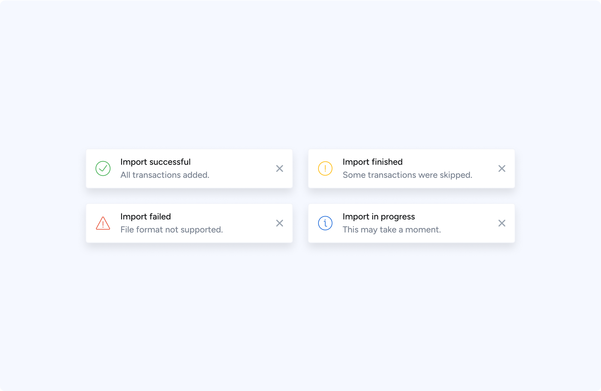
Before: After importing accounts, users had to continuously refresh the screen to see if their import had completed.
After: Added auto-refresh and real-time toast notifications to clearly show when imports were successful or if there were errors.
Feedback from customer service
CS feedback: This would make it easier to support customers and solve many recurring user issues. Tested with the team, and feedback was very positive.
Validating through user testing
Real-time testing with new users on UserBrain.com showed clear improvements: uploading and sorting wallets was significantly easier.
New wallet dashboard.
OUTCOME
Measurable Impact
~2x Faster wallet imports
Streamlined the process, reducing average completion time from ~5 minutes to under 2 minutes.
How we know
Time-on-task data from analytics.
Why it matters
Quicker setup reduces drop-off and gets users to tax results sooner.

18% Higher task completion rates
First-time import completion increased by 28% after launch.
How we know
Funnel tracking in Google Analytics.
Why it matters
More users reach the point where they can see value from the product, boosting retention.
25% Fewer support tickets
“Can’t find my wallet” tickets fell by 35% within a month.
How we know
Tagged support tickets in Zendesk.
Why it matters
Reduces strain on support and improves user trust in the platform.
Reflections
Working on ZenLedger was a great opportunity to enhance a product at a time of significant growth. Some key takeaways include:
User-Centered Design: Direct user feedback informed every design decision, making the experience more intuitive and reducing friction.
Trust & Transparency: Trust is a critical factor in handling sensitive financial data, and improving the onboarding process helped increase user confidence.
Iterative Improvements: By making small, iterative changes and continuously testing with users, we were able to refine the flow and reduce customer support calls significantly
Next steps
Ability to import multiple blockchains at once: A valuable next step would be letting users import data from multiple blockchains in one flow, no matter the wallet or exchange. This would cut down on repetition, save time, and lower the risk of missed transactions—better matching how users actually manage their crypto.
Adding a progress stepper: Introducing a progress stepper would guide users from their first import through to downloading tax documents. It would make the process clearer, reduce uncertainty, and give users confidence that they’ve completed all steps correctly.

Previous Case Study
Next Case Study
Got a project in mind?
Let’s work together
Say Hello