


CASE STUDIES

Redesigning the Patient Search Experience

RB&HH NHS Trust is a leader in cardiovascular and respiratory research, renowned globally for its contributions to healthcare, needed a new website to help engage their B2B & B2C audience.
My Contribution
I redesigned the entire RB&HH public and private hospital websites, covering research, workshops, and full UX/UI delivery. This case study focuses on the specialist search and conditions sections, where my redesign made it easier for patients to find specialists, understand care pathways, and access support.
Client
Royal Brompton & Harefield Hospital Trust
Category
Healthcare, Responsive Web Design, IA
Team
2 Developers, CTO, 1 Project Manager
Timeline
3 Months
Problem
Trust's existing website was outdated, difficult to navigate, and failed to reflect its prestigious status. Two of the key areas, “Specialists” and “Conditions” were disjointed and difficult to navigate.
Solution
Redesign the specialist search and conditions sections to improve findability, helping patients connect with the right specialists, understand care pathways, and access support.
RESEARCH
Key Findings

Interviewed patients and family onsite
Patient and family interviews revealed how people searched for specialists and highlighted key frustrations that shaped our findings.
- Difficulty finding specialists
- Wanted up-to-date information on conditions and related treatments
- Overseas customers looking for a consultant for their condition
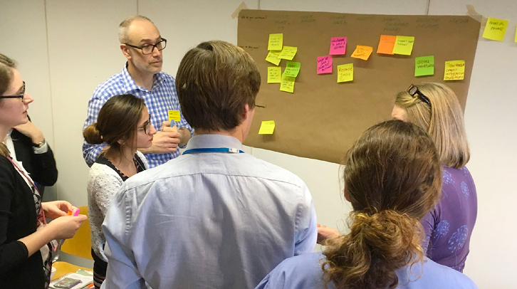
Internal workshops with doctors, nurses and stakeholders
Workshops with doctors, nurses, and admin staff uncovered pain points in daily workflows and informed the findings that follow.
- Link conditions to treatments
- Showcase research and expertise via consultants and vice versa
- Dashboard adding confusion
- Combine searches
Website audit
A full audit of the existing website highlighted usability issues, outdated content, and gaps in accessibility that guided our findings.
- Poor CMS
- Services pages bloated with content and cognitive overload
- Disjointed user flows with many dead ends
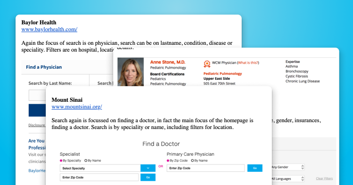
Competitor analysis
Competitor analysis focused on search and information architecture, showing how other hospitals structured content and highlighting opportunities to improve our own.
- Good consultant search
- Clear information on services
- Related consultants and conditions
DESIGN
Designing with Patients in Mind
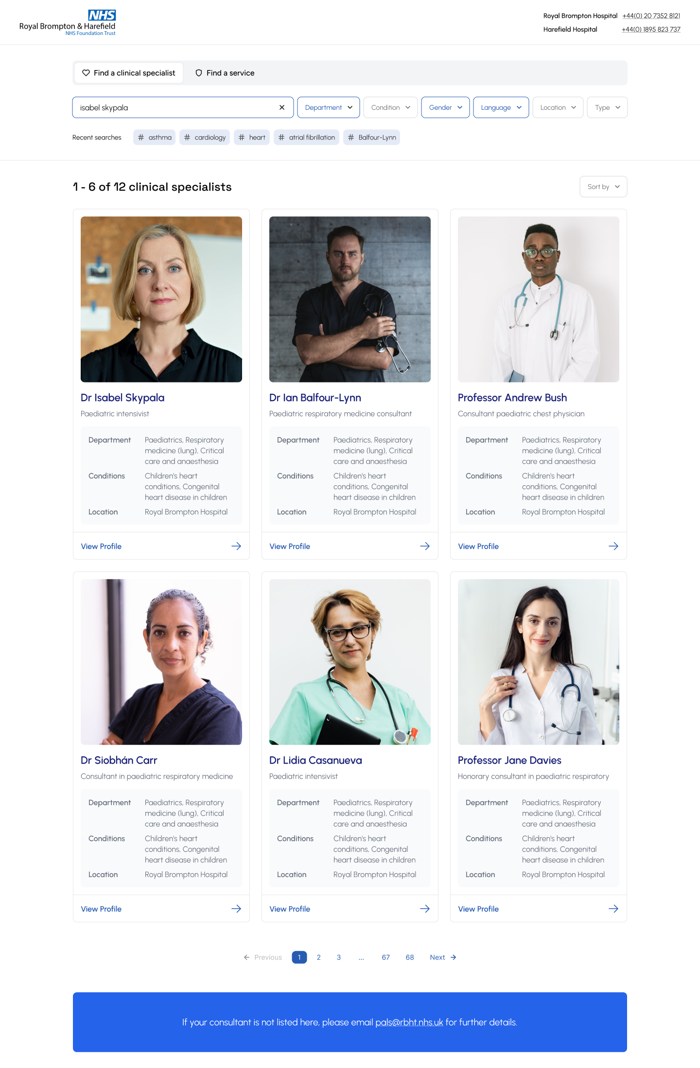
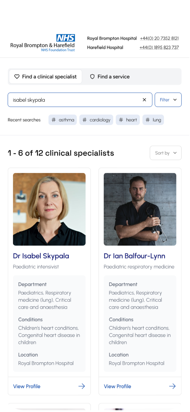
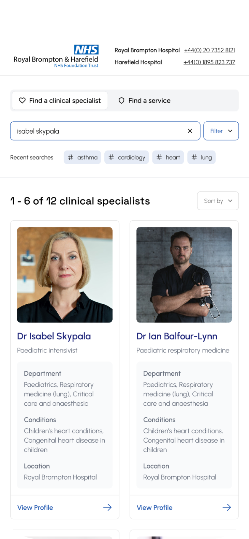
Search by consultant name, specialism, condition, symptoms or department. This gave users multiple ways of finding the right specialist.
Filtering allowed users to specify further by selecting specialty, gender, language spoken, availability, and location (e.g. main hospital vs. private hospital).
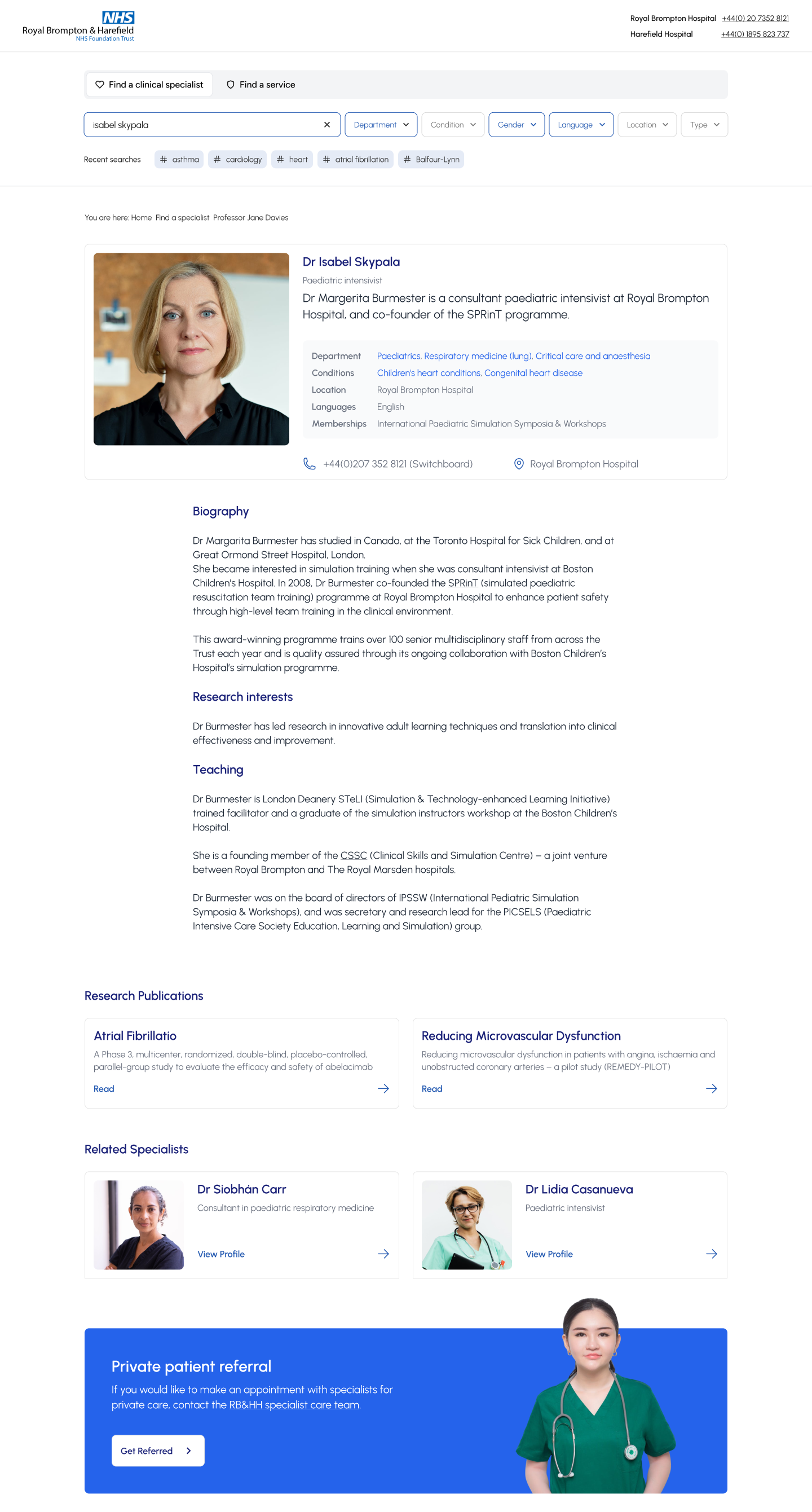
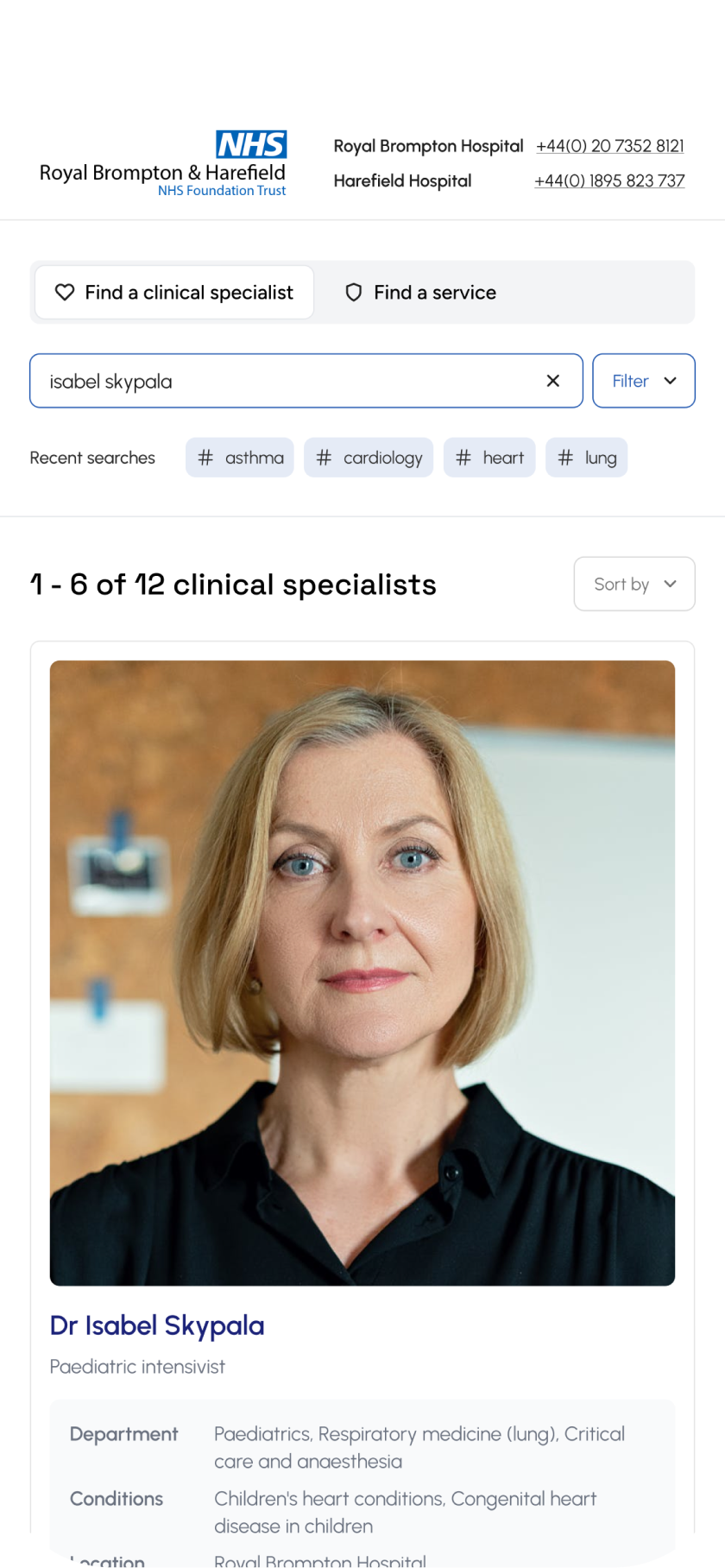
Patients could quickly scan consultant profiles to see expertise, credentials, reviews, languages, and availability. From there they could book an appointment or request a call-back, with related consultants suggested if their first choice was unavailable.
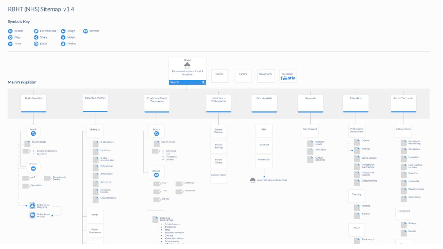
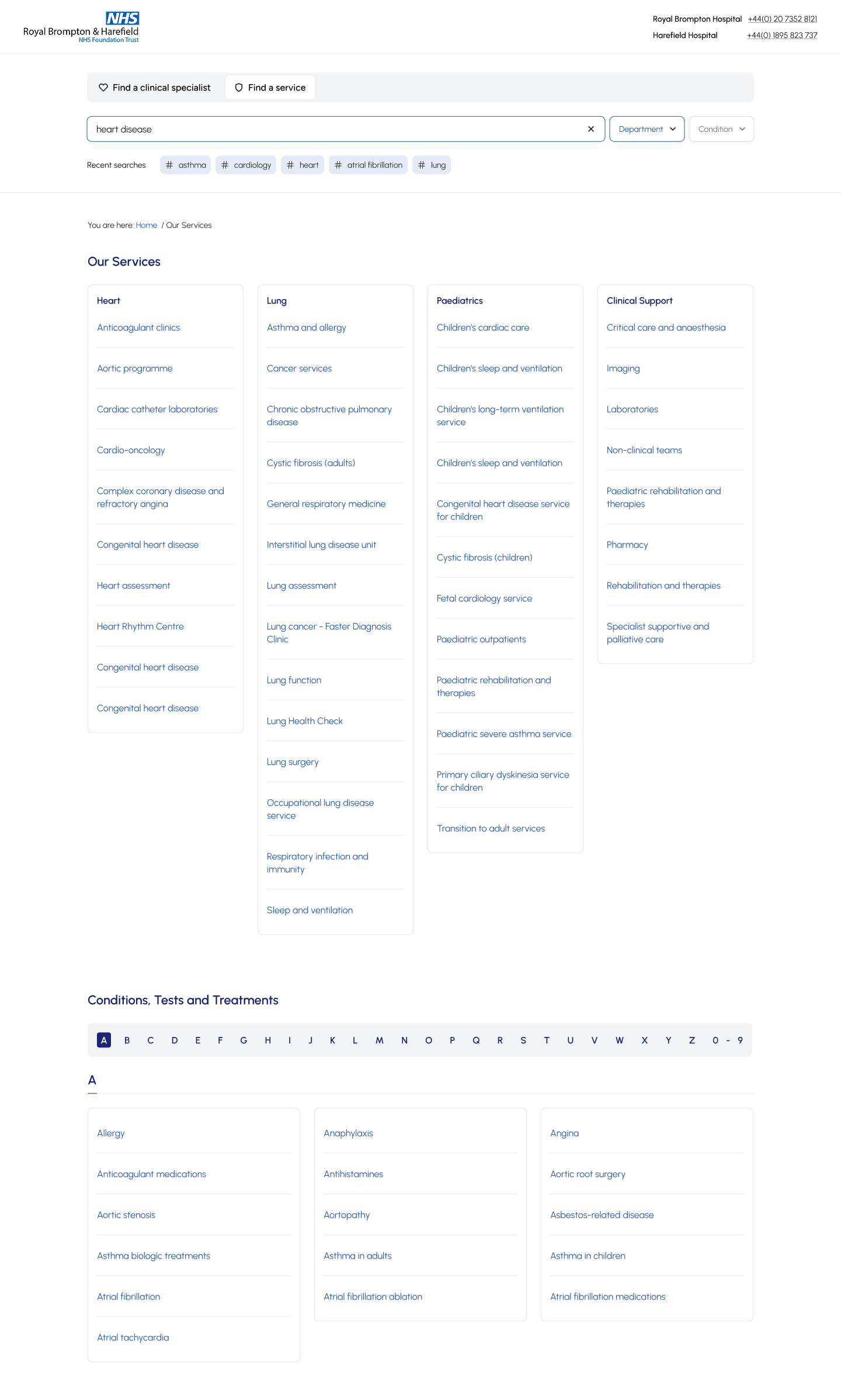
The conditions index provides a complete directory of all conditions, treatments and services available at the Trust. It’s designed to help patients, families and healthcare professionals quickly find clear, reliable information about specific health conditions and explore the treatments offered.
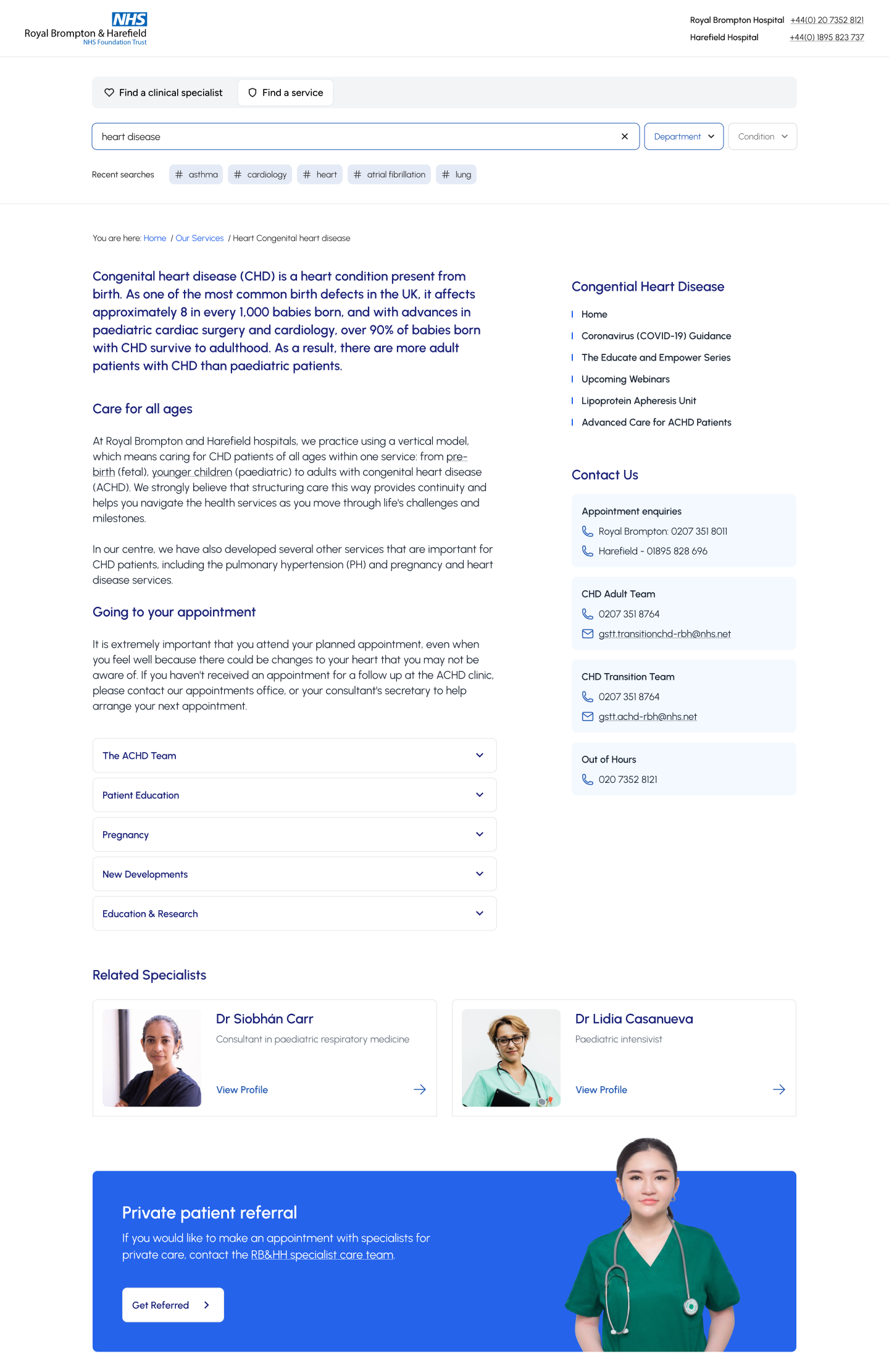
I designed the Conditions and Diagnosis page to highlight the hospitals’ expertise in heart and lung care, making it easy for patients to find information, understand care pathways, and access support for their specific condition.
Validating through user testing
We ran several rounds of usability testing with high-fidelity wireframes, both remote and in person. Patient feedback showed that the search needed clearer entry points and more intuitive filters to narrow results, while staff highlighted the value of related information appearing alongside consultant profiles.
terating on these insights helped us design a search and filtering system that was faster, more accurate, and more useful in real scenarios.
Stakeholder alignment
Regular reviews with the NHS steering group and private care team ensured alignment with both NHS and commercial goals.

OUTCOME
Measuring Success
Faster, relevant results
Users could quickly find the right consultant by name, specialty, or treated condition through a unified, mobile-friendly search tool.
How we know
On-site user testing showed a 40% faster time-to-result, with patients reporting less confusion when matching conditions to specialists.
Why it matters
Faster, clearer search reduced patient frustration and improved access to care, supporting both patient satisfaction and private care bookings.

Increased consultant enquries
Hospital enquiries for private consultants increased as patients were able to connect more easily with the right specialist.
How we know
Analytics showed a rise in completed consultant enquiries after launch, supported by feedback from the private care team noting fewer drop-offs in the enquiry process.
Why it matters
More successful enquiries strengthened the hospital’s private care revenue stream while building trust in the service’s ability to match patients with the right expertise.
Reflections
This project was a great learning opportunity, particularly in terms of designing for a complex stakeholder environment and handling the governance challenges that come with healthcare institutions. Key takeaways included:
The importance of direct patient feedback: By conducting patient interviews and on-site testing, we ensured the redesign addressed real user concerns.
Balancing clinical and commercial needs: The project involved navigating the differing priorities between the NHS team and the private Specialist Care division.
Cross-functional collaboration: Working with doctors, nurses, developers, and other stakeholders reinforced the value of a collaborative approach to designing complex, multi-user websites.
Next steps
Unfortunately, the scope of the project didn’t allow us to fully explore or implement solutions for some of the underlying administrative challenges patients faced, particularly around appointment coordination and real-time communication.
I would have loved the opportunity to delve deeper into this area, especially to prototype and test some of the ideas our team had around improving administrative workflows and reducing friction for both patients and hospital staff.

Previous Case Study
Next Case Study

Got a project in mind?
Let’s work together
Say Hello
CASE STUDIES
Connecting Patients with Consultants
RB&HH NHS Trust is a leader in cardiovascular and respiratory research, renowned globally for its contributions to healthcare, needed a new website to help engage their B2B & B2C audience.
My Contribution
I redesigned the entire RB&HH public and private hospital websites, covering research, workshops, and full UX/UI delivery. This case study focuses on the specialist search and conditions sections, where my redesign made it easier for patients to find specialists, understand care pathways, and access support.
Client
Royal Brompton & Harefield Hospital Trust
Category
Healthcare, Responsive Web Design, IA
Team
2 Developers, CTO, 1 Project Manager
Timeline
3 Months
Problem
Trust's existing website was outdated, difficult to navigate, and failed to reflect its prestigious status. Two of the key areas, “Specialists” and “Conditions” were disjointed and difficult to navigate.
Solution
Redesign the specialist search and conditions sections to improve findability, helping patients connect with the right specialists, understand care pathways, and access support.
RESEARCH
Key Findings
Interviewed patients and family onsite
Patient and family interviews revealed how people searched for specialists and highlighted key frustrations that shaped our findings.
- Difficulty finding specialists
- Wanted up-to-date information on conditions and related treatments
- Overseas customers looking for a consultant for their condition
Internal workshops with doctors, nurses and stakeholders
Workshops with doctors, nurses, and admin staff uncovered pain points in daily workflows and informed the findings that follow.
- Link conditions to treatments
- Showcase research and expertise via consultants and vice versa
- Dashboard adding confusion
- Combine searches
Website audit
A full audit of the existing website highlighted usability issues, outdated content, and gaps in accessibility that guided our findings.
- Poor CMS
- Services pages bloated with content and cognitive overload
- Disjointed user flows with many dead ends
Competitor analysis
Competitor analysis focused on search and information architecture, showing how other hospitals structured content and highlighting opportunities to improve our own.
- Good consultant search
- Clear information on services
- Related consultants and conditions
DESIGN
Designing with Patients in Mind
Search by consultant name, specialism, condition, symptoms or department. This gave users multiple ways of finding the right specialist.
Filtering allowed users to specify further by selecting specialty, gender, language spoken, availability, and location (e.g. main hospital vs. private hospital).
Patients could quickly scan consultant profiles to see expertise, credentials, reviews, languages, and availability. From there they could book an appointment or request a call-back, with related consultants suggested if their first choice was unavailable.
The conditions index provides a complete directory of all conditions, treatments and services available at the Trust. It’s designed to help patients, families and healthcare professionals quickly find clear, reliable information about specific health conditions and explore the treatments offered.
I designed the Conditions and Diagnosis page to highlight the hospitals’ expertise in heart and lung care, making it easy for patients to find information, understand care pathways, and access support for their specific condition.
Validating through user testing
We ran several rounds of usability testing with high-fidelity wireframes, both remote and in person. Patient feedback showed that the search needed clearer entry points and more intuitive filters to narrow results, while staff highlighted the value of related information appearing alongside consultant profiles.
terating on these insights helped us design a search and filtering system that was faster, more accurate, and more useful in real scenarios.
Stakeholder alignment
Regular reviews with the NHS steering group and private care team ensured alignment with both NHS and commercial goals.
OUTCOME
Measurable Impact
Faster, relevant results
Users could quickly find the right consultant by name, specialty, or treated condition through a unified, mobile-friendly search tool.
How we know
On-site user testing showed a 40% faster time-to-result, with patients reporting less confusion when matching conditions to specialists.
Why it matters
Faster, clearer search reduced patient frustration and improved access to care, supporting both patient satisfaction and private care bookings.

Increased consultant enquries
Hospital enquiries for private consultants increased as patients were able to connect more easily with the right specialist.
How we know
Analytics showed a rise in completed consultant enquiries after launch, supported by feedback from the private care team noting fewer drop-offs in the enquiry process.
Why it matters
More successful enquiries strengthened the hospital’s private care revenue stream while building trust in the service’s ability to match patients with the right expertise.
Reflections
This project was a great learning opportunity, particularly in terms of designing for a complex stakeholder environment and handling the governance challenges that come with healthcare institutions. Key takeaways included:
The importance of direct patient feedback: By conducting patient interviews and on-site testing, we ensured the redesign addressed real user concerns.
Balancing clinical and commercial needs: The project involved navigating the differing priorities between the NHS team and the private Specialist Care division.
Cross-functional collaboration: Working with doctors, nurses, developers, and other stakeholders reinforced the value of a collaborative approach to designing complex, multi-user websites.
Next steps
Unfortunately, the scope of the project didn’t allow us to fully explore or implement solutions for some of the underlying administrative challenges patients faced, particularly around appointment coordination and real-time communication.
I would have loved the opportunity to delve deeper into this area, especially to prototype and test some of the ideas our team had around improving administrative workflows and reducing friction for both patients and hospital staff.
Previous Case Study
Next Case Study
Got a project in mind?
Let’s work together
Say Hello